To add custom Colors to SharePoint
-
- Install SharePointOnlineManagementShell tools
- Run this Scrip in Sharepoint
$ID =“Domain”
$themeName =“Pallette_Name”
$SiteID = ‘00000000-0000-0000-0000-00000000000’
#Connect to SharePoint
$adminSiteUrl = “https://”+$ID+“-admin.sharepoint.com”
Connect-SPOService $adminSiteUrl
#Update the Palette
$palette = @{
“themePrimary” = “#102542”; #Navy
“themeLighterAlt” = “#d3dce8”;
“themeLighter” = “#fee7e5”; #Coral, themeLighter
“themeLight” = “#fdd3ce”; #Coral, themeLight
“themeTertiary” = “#7088aa”;
“themeSecondary” = “#567095”;
“themeDarkAlt” = “#F87060”; #Coral;
“themeDark” = “#F87060”; #Coral
“themeDarker” = “#1c3557”;
“neutralLighterAlt” = “#f8f8f8”;
“neutralLighter” = “#f4f4f4”;
“neutralLight” = “#eaeaea”;
“neutralQuaternaryAlt” = “#dadada”;
“neutralQuaternary” = “#d0d0d0”;
“neutralTertiaryAlt” = “#c8c8c8”;
“neutralTertiary” = “#d4d4d4”;
“neutralSecondary” = “#53C7BD”; #Turquoise
“neutralPrimaryAlt” = “#818181”;
“neutralPrimary” = “#8c8c8c”;
“neutralDark” = “#555555”;
“black” = “#3f3f3f”;
“white” = “#ffffff”;
“accent” = “#F87060”; #Coral;
“backgroundOverlay” = “#102542”; #Navy
}
#Uncomment if you want to update an existing theme
#Remove-SPOTheme -name $themeName
#Replace the variable value with the generated code
#Add The Theme
Add-SPOTheme -Name $themeName -Palette $palette -IsInverted:$false -Overwrite
$SPO = Get-SPOTheme
$SPO.Palette[1]
Colors Locations:

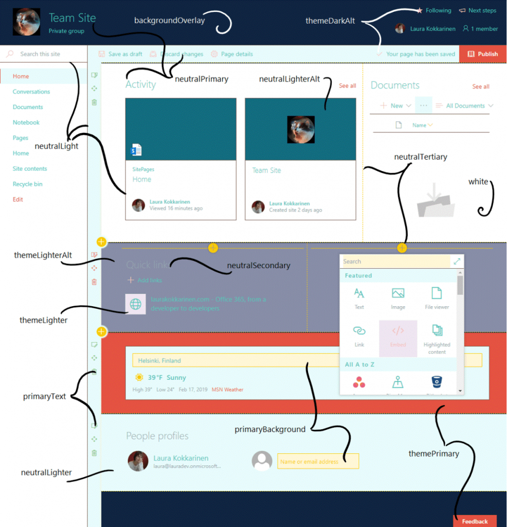

Color Details:
| TOKEN NAME | IMPACT | RECOMMENDED SHADE | OCCURRENCE | |
| themePrimary | Dominant | Darker | Some button and checkbox backgrounds, links, texts, borders and icons, icon and link hovers. Also the footer background color, and one of the section background options. System pages: OK button background, link texts. |
|
| themeLighterAlt | Dominant | Lighter | One of the section background options. Cogwheel menu hover background in site contents view. | |
| themeLighter | Noticeable | Lighter | Navigation edit menu background color, add web part panel hover background color, image background color in some web parts when the third section background color option is selected. System pages: Navigation hover background, cancel button hover background. |
|
| themeLight | Subtle | Either | Range selector hover and focus background. Loading spinner background color in site contents view. | |
| themeTertiary | Subtle | Darker | Add web part icon when the fourth selection background color is selected. The third color in the palette icon in the “Change the look panel” (hence the token name) | |
| themeSecondary | Subtle | Lighter | The suite bar text color in site contents view. Hover color for some links. Image background color in some web parts when the fourth section background color is selected. The second color in the palette icon in the “Change the look panel” (hence the token name) | |
| themeDarkAlt | Dominant | Darker | Many icons (e.g., in the command bar), some borders, button/link hovers, spinner background, range element focus, checkbox background hover, web parts and lists, button hover, range element focus, add web part icon when the third section background color is selected. | |
| themeDark | Subtle | Darker | Some button onclick and link color (e.g., “Return to classic SharePoint”). Header “Follow” star icon if the third header background color option is used. System pages: OK button border and hover. |
|
| themeDarker | Subtle | Darker | Hover color for some links. System pages: Visited link color. |
|
| neutralLighterAlt | Noticeable | Lighter | Left navigation hover background color, list info panel text background, image background color in some webparts when the first section background color is selected, some icons and texts when editing web parts. System pages: Cancel button background, disabled text box background. |
|
| neutralLighter | Dominant | Lighter | Some menu backgrounds (e.g., the command bar), selected left navigation element, some button backgrounds, ome option for a section background color. | |
| neutralLight | Dominant | Lighter | Some web part borders, command bar action hover, command bar background when a list item is selected, list view category header background when an item is selected, button hover. System pages: Ribbon tab background, OK button border, selected navigation element background, disabled text box border. Divider web part. Image background color in some web parts when the second section background color option is selected. |
|
| neutralQuaternaryAlt | Subtle | Lighter | Info icon and selected ellipses background in lists, some web part element backgrounds when in edit mode, web part property pane dropdown item background color, selected list item background. | |
| neutralQuaternary | Subtle | Lighter | Command bar action hover background when a list item is selected. System pages: Borders |
|
| neutralTertiaryAlt | Subtle | Darker | Some texts, e.g., in web part property pane, some icons in web parts, range selector background, some button onclick background color, yes/no toggle control background, change section background color setting border color. | |
| neutralTertiary | Noticeable | Darker | Some button texts, some web part titles, some web part setting texts, some web part icons, border hover color in some web parts, dashed section border color in edit mode, web part settings panel control border color. Most visible when editing web parts. System pages: text box, dropdown, and button border color. |
|
| neutralSecondary | Dominant | Darker | Some menu texts, empty library text, some icon hover backgrounds, some texts in web parts, command bar arrows, range selector. System pages: link color, some icons, and borders. |
|
| neutralPrimaryAlt | Noticeable | Darker | The suite bar background color in site contents view. | |
| neutralPrimary | Dominant | Darker | Site header texts, texts in navigation menux, command bar, buttons and web parts, web part related icon backgrounds when the page is in edit mode, add web part panel icons and texts, web part settings panel texts. System pages: dropdown arrow color, some texts. |
|
| neutralDark | Subtle | Darker | Some button, link and border hover text color, some icons. System pages: page breadcrumb, header texts. |
|
| black | Subtle | Darker | Web part settings panel dropdown text color, carousel controls, site contents tab text hover, “Change the look” panel texts. | |
| white | Dominant | Lighter | Primary body background color, some icon hover color, one of the available section background colors. System pages: Body background color |
|
| primaryBackground | Dominant | Lighter | Some backgrounds when editing web part settings, some text field backgrounds, cogwheel menu background in site contents view. | |
| primaryText | Subtle | Darker | Edit section icons. Cogwheel menu texts in site contents view. | |
| accent | Subtle | Darker | The fourth color in the palette in the “Change the look” panel. | |
| whiteTranslucent40 | Subtle | Lighter, Translucent | Covers the rest of page when a modal dialog is opened. A solid color can be specified to get rid of transparency. | |
| backgroundOverlay | Dominant | Either | Header background, comment section background, some borders, site contents primary background color |
-
Sharepoint URLs
- All Documents
- https://<yourdomain>.sharepoint.com/Shared%20Documents/Forms/AllItems.aspx
- Composed Looks – All Items
- https://<yourdomain>.sharepoint.com/sites/<SiteName>/_catalogs/design/AllItems.aspx
- SiteID
- https://<yourdomain>.sharepoint.com/sites/<SiteName>/_api/site/id
- Themes
- https://<yourdomain>.sharepoint.com/_catalogs/theme/Forms/AllItems.aspx
- SharePoint themes and colors | Microsoft Learn